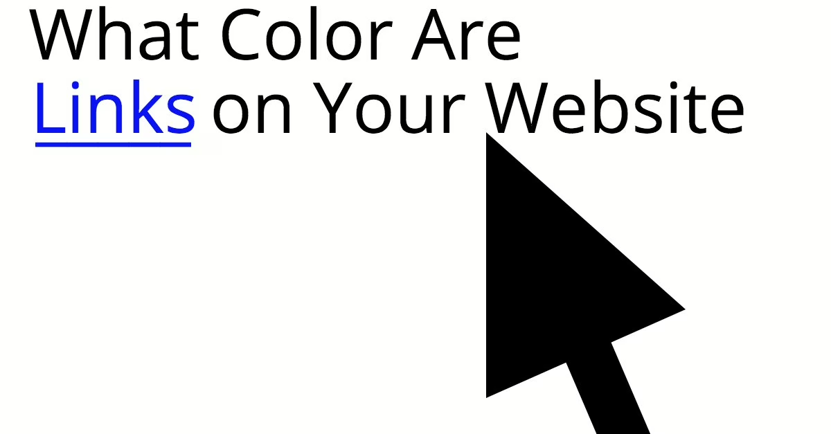
Have you ever visited a website and tried to click on some text that looked like a link, only to be deceived by the author (see what I just did there)? It’s happened to me a few times, and often because the client treats their website as though it is Microsoft Word. While it seems like something obvious, some writers neglect these basic rules and make a mess of their sites from the visitor’s experience. Nothing happens when I click on text that is blue and underlined, despite expecting a link to take me somewhere.
Website Design: Best Practices
- When you are writing posts on your website, it is important that you avoid underlining text at all unless it’s a link. This keeps visitors from getting confused. Always underline links to help people with vision challenges.
- The only text that should be blue is a link that hasn’t been visited yet. Likewise, reserve bright purple for visited links (though this is slightly less important).
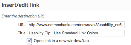
- Always fill in the alt text describing where visitors will go if they click the link. This displays when they mouse over the link, as well as for visitors using screen readers to help them navigate.

To learn more about usability standards, see this timeless article from Netmechanic.
