What areas of your website navigation pass the test? See this Slideshare to review what areas of your site may need help with usability:
[slideshare id=28002773&doc=responsivedesign-ahg2013-131107075208-phpapp01]
Responsive Navigation
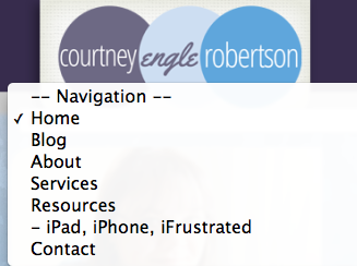
When people visit your website, can they navigate around without pinching and zooming, especially on your navigation bar? On this site, I implement a drop navigation system that works well for thumbs. This is built in to my preferred theme framework, Headway. Users click on the drop menu, and select what page they want to go to. Dropboxes like this are common in forms elsewhere online, and make sense for users. It’s clear to the visitor that there is something there to click on.
Accessibility Navigation
Remember that you may have visitors to your website that are using screen reading software to overcome visual impairment challenges or navigating with alternate methods like a mouse controlled by their chin. The navigation menu needs to include descriptive text that screen reading software can share to the visitor.
What not to do: The Hamburger Menu
What’s a hamburger menu? It’s the 3 simple lines popularized in the corners of the screen of many mobile apps. The problem is, many users rarely know that it is a menu. They simply don’t click. Other users with accessibility challenges may have a hard time getting to that specific area and then navigating around within the menu. I would suggest avoiding the Hamburger menu style as much as possible. It makes life more challenging for most users. See TechCrunch’s review of this issue.
