Have you looked at your website lately on a few different types of mobile devices? How does it look on Apple, Android, Windows, and Blackberry smartphones? How does it look on tablets? And now, how does it look on different browsers, screen sizes, and platforms of laptops and desktops? If you haven’t tested those out for yourself, ask your friends that have these devices now to take a look and send you a picture of what they see. Head to your nearest mobile phone or computer store to take a peak. Just on the websites that I administrate through Google Analytics, I am seeing roughly 20 – 33% of all traffic coming from mobile devices. This trend will only continue. To know how to fix your site, you need to know some of the terminology.
Mobile Responsive
Web design approach aimed at crafting sites to provide an optimal viewing experience—easy reading and navigation with a minimum of resizing, panning, and scrolling—across a wide range of devices (from desktop computer monitors to mobile phones) ~Wikipedia
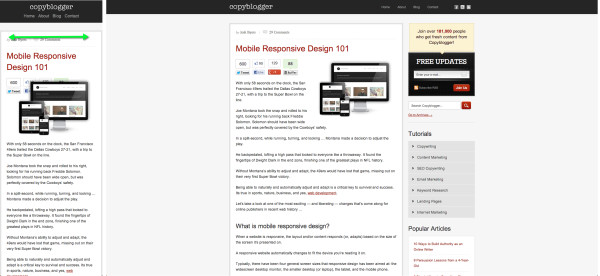
Give this site or any other a test by making your browser as skinny as it can be. Watch how the site resizes just by changing the width of the browser. This won’t always be completely flawless, but it is a quick way to get an idea about how your site will look.
Mobile Landing Page
A mobile landing page is a simple mobile web page that is the destination location of mobile advertising or QR code ~SourcePro
You will want your entire site to look good on a mobile device, and in addition you may want to use mobile landing pages that are stripped of the overall site theme and navigation. A good use of this might be a QR code on your storefront window that leads people to see a menu or hours.
Tools for making your site look good on mobile:
- A mobile responsive template – I use Headway on my WordPress website. It automatically scales text and layouts to work on mobile devices. Your videos won’t be chopped off the screen, and you won’t need to pinch and zoom to read what you want.
- A mobile landing page plugin – Check out OMFG Mobile Pro to setup quick landing pages for mobile campaigns
- Fluid video & pictures if your theme doesn’t support it (Headway makes quick work fo this so I don’t need it on my of my sites). You want to be sure your graphics and video embeds scale to fit on the width of tiny smartphones. See Fluid Video Embeds & Fluid Images
Do you have any other good mobile tools for websites? Leave your tip in the comments below.
Comments
One response
If someone searches for what your website offers, does it even display in mobile Google search results? It might startle you to know that since…