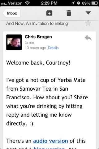
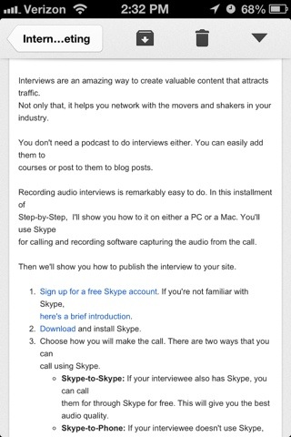
How does your email newsletter look on a mobile device? Have you opened it up to preview it that way? I’ve opened up two different email newsletters and snapped a screenshot on my iPhone 4s. Which of these is easier on your eyes to read?
 [JPG, 39.92 KB]
 [JPG, 42.22 KB]
I find reading Chris Brogan‘s newsletter on my mobile device easy, which most other newsletters are not. The main reason for this is that he uses font that is bigger than most. From the computer, that size font may seem unnecessarily large. However, it feels the like right size on mobile devices. I’d rather aim for mobile devices accessibility and tolerate the larger looking font on the computer screen. Take a look at your newsletters on your phone. How do they look now? If possible, see if your email newsletter system provides you details about your mobile open rate. Be sure what you are sharing is viewable to the primary place people are being notified about your latest updates. I’ve just relaunched my own newsletter and will be sharing insights to everyday needs small business owners face weekly along with tips and tools surrounding Social Media, Local SEO, WordPress, and Mobile Marketing. I’d love to share this with you. https://courtneyr.dev/resources/newsletter